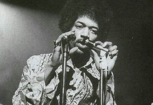
Jimi Hendrix seems to have been a man who struggled with strife. Hendrix’s wild stage persona, which was known for pyromania and stereotypical rock ‘n’ roll hedonism, was at odds with the attitude that his friends would remember him for after his tragic passing. Hendrix was characterized by many who knew him as a calm, easygoing man who occasionally experienced moments of shyness.
“In real life, Jimi Hendrix was nothing like the wild guy that he portrayed on stage,” Dave Davies, the Kinks’ guitarist, once reminisced about his deceased friend. “He was a quiet, introverted guy like Ray was. He was explosive on stage but very softly spoken off it. I’d see him from time to time at the Scotch of St James or at parties. We used to exchange the odd word to each other, but it was never like we were close.”
Hendrix’s vanity ran counter to his less-than-sociable demeanor. Hendrix always made care to wear the loudest attire, even if he might not have spoken much at social gatherings. It’s common to criticize vanity, yet it’s crucial to cherish one’s looks. It may convey your individual artistic flare and, in Hendrix’s case, make up for social awkwardness.
The record covers that Hendrix produced also demonstrated his attention to aesthetics. Hendrix was quite particular about the record sleeves for his albums, therefore the US and UK editions of several of his albums usually had different covers.
Are You Experienced, the Jimi Hendrix Experience’s 1967 first album, included immortal standards like “Foxy Lady,” “Purple Haze,” and “The Wind Cries Mary” to showcase Hendrix’s unmatched guitar prowess. The album’s artwork featured a picture of Hendrix donning a cape and flying above his comrades Noel Redding and Mitch Mitchell as it was initially released in the UK.
“[Hendrix’s] music at the time was pretty wild, and the prevalent thing at the time was psychedelic and all things strange, so you had to do something odd,” according to Bruce Fleming, who took the original cover photo, in his book Jimi Hendrix and the Making of Are You Experienced.“The more outrageous and outlandish you got, the better. So I went for a dark green background – deep, deep green – and then just him with his cloak up.”
Unfortunately, Hendrix detested the photograph and insisted on a different one for the album’s US release because he felt the robe made him “look like a fairy.” Hendrix and the Experience hired Karl Ferris to produce the updated artwork, and he utilized a fish-eye lens and some acid-wash color effects to give it a psychedelic appearance. The trio’s trademark circle picture was included on the US cover, which also featured purple letters over a bright yellow backdrop.
When the time came to create the cover for their second studio album, Axis: Bold as Love, the band called Ferris because they were happy with the cover. This time, photographer Ferris’ brand-new image was altered by artist Roger Law, who combined it with a colorful arrangement of the numerous forms of the Hindu god Vishnu.
“When I first saw that [cover] design, I thought, ‘It’s great,’ but maybe we should have an American Indian,” In the book Jimi Hendrix: The Ultimate Experience, Hendrix is reported as stating. Hendrix like the colorful artwork, but he saw no real relationship between the band and the Hindu god.“The three of us have nothing to do with what’s on the Axis cover.”
Hendrix made sure to write an exact description of what he intended for the Electric Ladyland cover in 1968 after earlier misalignments. He provided his record company a thorough set of instructions along with a preliminary drawing of the sleeve he had in mind, which was a picture of Hendrix playing with kids on the Alice in Wonderland sculpture in Central Park, shot by Linda Eastman (later married to Paul McCartney).
The recalcitrant label executives made the decision to advertise the record with an entirely new look, in defiance of Hendrix’s clear preferences. Hendrix was forced to use another Ferris shot, this time a red and orange exposure taken during a concert at London’s Saville Theatre, while the Linda Eastman concept appeared on the album’s 50th-anniversary cover.
Once more, Electric Ladyland’s UK release had a unique aesthetic. The label chose a contentious image of 19 nude women sitting in front of the camera, three of whom were clutching previous Hendrix recordings, rather than one of Hendrix and the band.
Hendrix wasn’t unhappy with the artwork despite the controversy around the cover’s sexual content; however, he would have been more happier had he been engaged in the choice.
“I didn’t know a thing about the English sleeve,” Hendrix revealed in 1968 to Melody Maker. “Still, you know me, I dug it anyway. Except I think it’s sad the way the photographer made the girls look ugly. Some of them are nice-looking chicks, but the photographer distorted the photograph with a fish-eye lens or something. That’s mean. It made the girls look bad.”