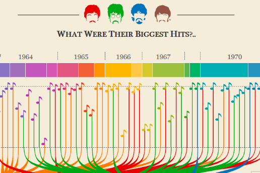
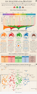
If you’re an overly-analytical Beatles fan, then this infographic is perfect for you!
The Beatles songwriting process is as iconic as the band itself and can be complex as their break up! Fans have spent years trying to decode true meanings of lyrics, unpacking the details behind songs, and how each song was put together, but today thanks to analytical artist Adam E. McCann, we now have a Beatles analysis infographic!
This incredibly detailed graph summarizes every question you’ve ever asked about the Beatles’ songwriting. McCann created the graph for the data visualization site Tableau and it effectively breaks down the ins and outs of the nature of John, Paul, Ringo and George’s songwriting. It even analyzes and gives answers to how the world received the songs they’ve written and so much more. So much actually, that you may need to spare a few days to dig into this analysis chart. It’s quite a lot of information to digest. But there’s a possibility that you might end up becoming a Beatles expert once you’ve gotten through each detail of this groundbreaking analytical tool.


